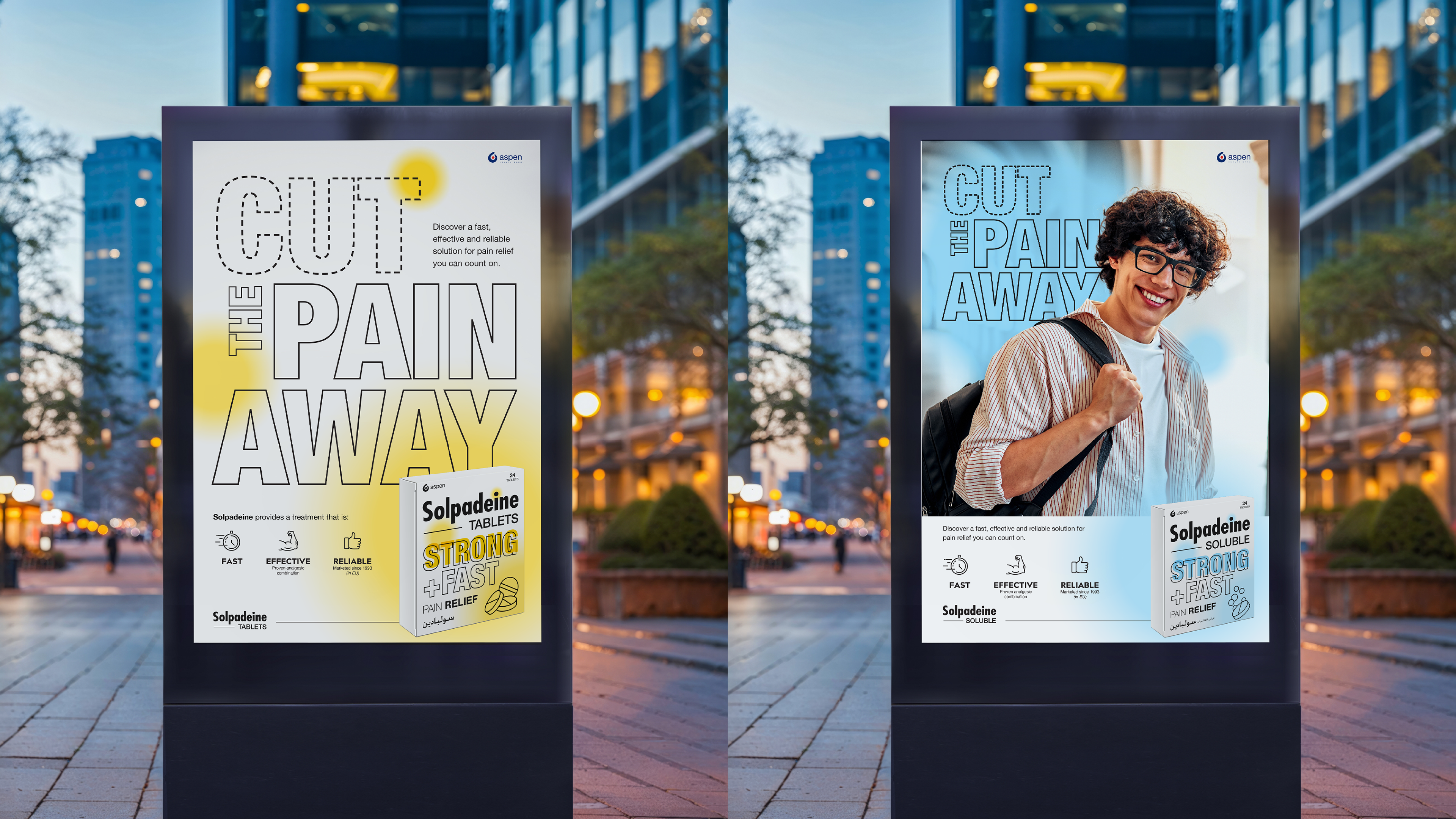
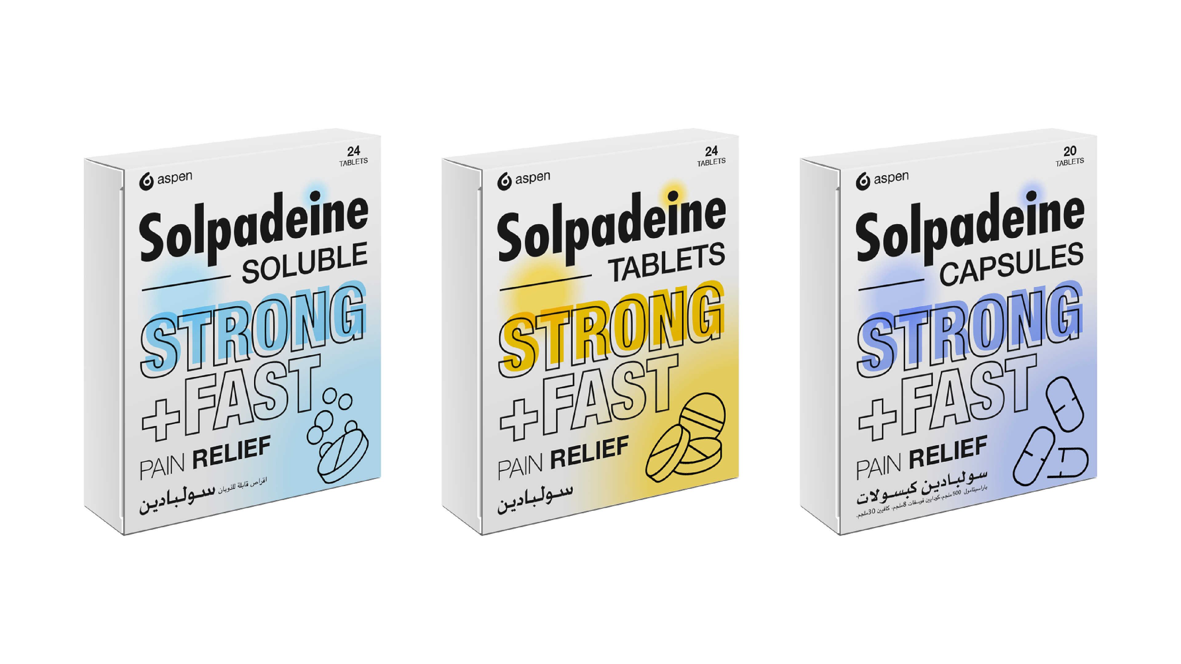
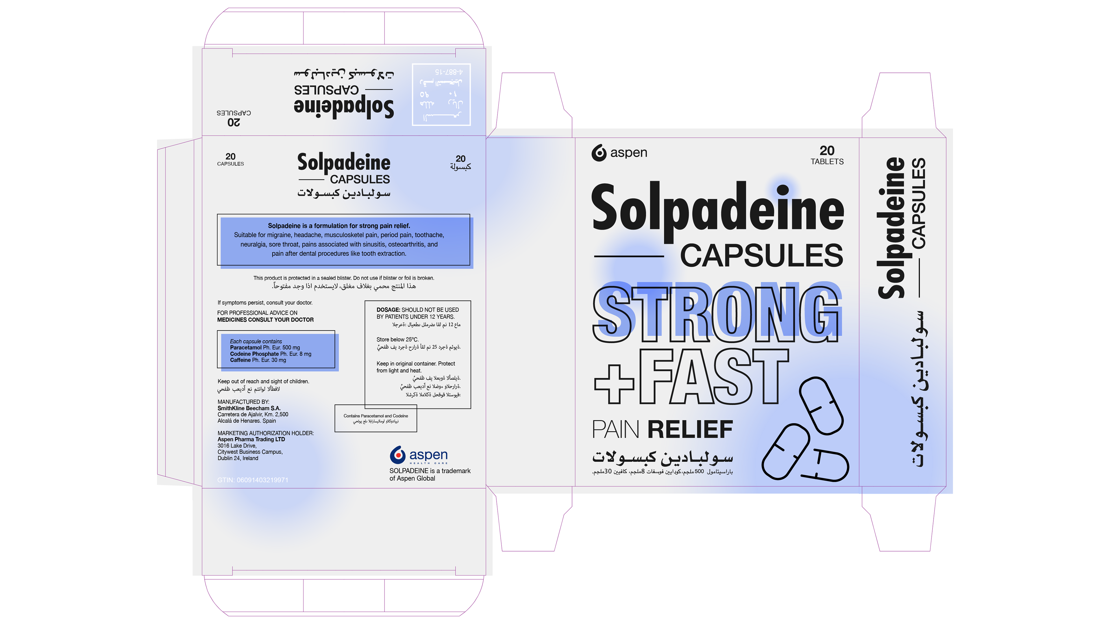
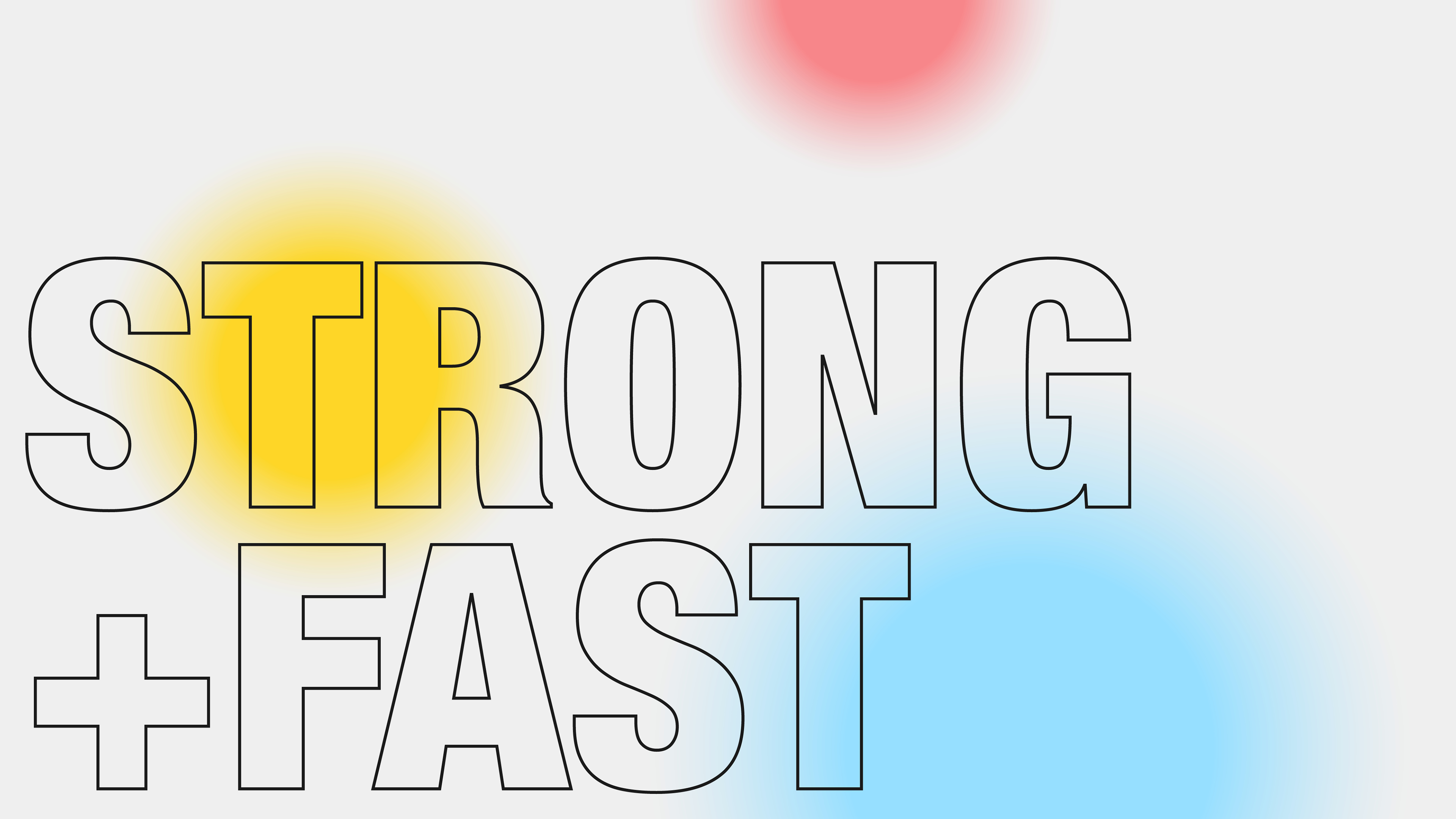
Packaging redesign and key visual system for Solpadeine's pain relief range. A clean design approach with a white base, differentiating the brand in a red-dominated category. Color-coded variants, simplified typography, and minimal iconography create clarity on shelf, while supporting the product's fast-acting message across all touchpoints.


PROJECT CREDITS
Agency: GL2U STUDIO
Creative & Packaging Design: Begum Baysal
Copywriter: Umut Gocmen
In collaboration with: Kimm Agency
Client: Solpadeine, Middle East
Year: 2025
Agency: GL2U STUDIO
Creative & Packaging Design: Begum Baysal
Copywriter: Umut Gocmen
In collaboration with: Kimm Agency
Client: Solpadeine, Middle East
Year: 2025
Have a project in mind?
Tell us about your project and we'll get back to you with ideas and next steps.